
Custom Search
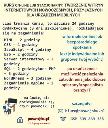
CENA - OFERTA: Jesteś zainteresowany/na kursem – zapraszam do kontaktu ze mną, szczegóły: www.poswojsku.pl .


What makes a website responsive? Hmm. Probably some spells. And if not magic, then what? By the way, what is this responsive website? Not only responsive, it is also adapted to mobile devices?
A responsive website is a website that changes as the resolution of the screen on which it is displayed changes. Look! You move the size of the screen (increase - reduce the browser window), and the page still occupies the entire width of the screen. Thanks to that, if you add her address to Google optimizers, you will see that this site is responsive and is "mobile friendly", i.e. adapted to mobile devices.
Website mobility and website responsiveness are achieved at two levels. The first level is the so-called viewport, the second is called media inquiries.
Viewport is a level that allows us to remain responsive. What is viewport? Viewport means a reference to the browser window. In our case, the value of the content attribute specifies the width of the browser window as the phone screen. In other words, we command mobile device browsers that often shrink pages not to just do so, but to use the actual screen size. But this is only the first level of responsiveness. What's next? Look at the css file.
I have three parts in the css file. The first part is the code intended for standard screen sizes, i.e. large screens. Then we have the code for screens, in my case, for which the maximum width is 1080 px. If you compare the code at the top of the file and the one under max width 1080, you will see that there are slightly different parameters. Parameters that cause smaller screens to match text and images to these screens. And finally, we have the media code for screens up to a maximum width of 769, i.e. we send another style sheet at the time when our site is played on a device that has this type of width. Of course, all this is managed by html and a web browser based on css files, but you can also force appropriate behavior by examining the page,
Welcome to the next part of the training series, in which I show how to make responsive, mobile websites. At least once a week another guide. For the record: we make a page with swap backgrounds, so simple: HTML5 + CSS3, but responsive and mobile-friendly. See working pattern www.pol-fashion.eu .
The class image in the css file is a piece of code that tells us (div image contained in the div) that (for @media (min-width: 1080px)):
the height is specified at 800 px
100% width, i.e. the entire screen
background-repeat: no-repeat; that is, the picture does not repeat - the background is only one picture
background-position: center; so the image is centered
background-attachment: fixed; co oznacza fixed a co oznacza background-size: contain;
Background-attachment defines how the background image behaves when you scroll the page. The image can either move with the content of the page or stay in place. Using the fixed value of the background-attachment property we can set that the image does not scroll. That's exactly how it is with us. Does not scroll with the given background content.
In turn, background-size is such an element that allows us to reduce, enlarge or distort the background image. We can use values in pixels, em units or we can use two keywords: contain and cover. We used contain, which adjusts the background image to the size of the element while maintaining the aspect ratio. Thanks to this, our website will be responsive and thanks to this our website will be adapted to mobile devices, because the images will be loaded in a very nice, simple way to fit the size of the screen on which they will be displayed.
Isn't that easy? Say it yourself or yourself. As I said, I am very happy if girls also read my advice. Take a look at all the CSS code.
/*
* poswojsku.pl sp. z o.o. (https://www.poswojsku.eu)
* Copyright 2011-2016 poswojsku Darek Gołębiowski, Inc.
* Licensed under MIT 2017
*/
/* Reset CSS */
html,
body,
div,
span,
h1,
h2,
p,
a{
margin: 0;
padding: 0;
border: 0;
font-size: 100%;
font: inherit;
vertical-align: baseline;
}
body {
opacity: 0.95;
box-shadow: 1px 1px 2px grey, 0 0 1em grey, 0 0 0.2em grey;
}
#nawigacja {
font-size: 1.3em;
font-weight: bold;
color: #fff;
padding: 0%;
}
#mainNav {
clear: both;
font-family: "Verdana", Courier, monospace;
background: rgb(28, 3, 3);
position: fixed;
top: 100px;
left: 20px;
padding: 30px 3px 10px 3px;
margin: 0;
border-radius: 0% 0% 9px 9px;
box-shadow: 1px 1px 2px grey, 0 0 1em grey, 0 0 0.2em grey;
z-index: 999;
list-style: none;
cursor: pointer;
display: inline;
opacity: 0.8;
width: 97%;
}
#mainNav li {
float: right;
width: 9em;
z-index: 900;
padding: 3px;
margin: 1px 1px 1px 10px;
}
#mainNav a {
color: rgba(255, 255, 255, 1);
font-weight: bold;
text-transform: uppercase;
text-decoration: none;
padding: 1px;
display: block;
}
#mainNav a:hover {
font-weight: bold;
color: red;
padding: 1px;
}
/* Menu responsywne */
.menuResponsywne {
display: none;
}
div.image {
height: 800px;
width: 100%;
background-repeat: no-repeat;
background-position: center;
background-attachment: fixed;
background-size: contain;
box-shadow: 1px 1px 2px grey, 0 0 1em grey, 0 0 0.2em grey;
}
#sliderPage1,
#sliderPage2,
#sliderPage3,
#sliderPage4,
#sliderPage5 {
width: 80%;
text-align: center;
font-size: 2.5em;
height: 95%;
border-radius: 5%;
margin: 8% auto 2% auto;
text-align: center;
background-color: rgba(255, 255, 255, 0.1);
}
#sliderPage1 p,
#sliderPage2 p,
#sliderPage3 p,
#sliderPage4 p,
#sliderPage5 p {
padding: 8px 2px 4px 2px;
max-height: 94%;
color: rgba(0, 0, 55, 1);
font-size: 0.9em;
}
#divFooter {
overflow: hidden;
width: 100%;
min-height: 50px;
position: fixed;
bottom: 0;
margin: 15px 0px 0px 0px;
background-color: #1E1D20;
opacity: 0.7;
}
.div_dg {
clear: both;
margin-top: 1%;
overflow: hidden;
}
.lewy {
float: left;
width: 47%;
margin: 0.2%;
padding: 0.2%;
}
.prawy {
float: right;
width: 47%;
margin: 0.2%;
padding: 0.2%;
}
.prawy img {
border-radius: 10%;
max-width: 100%;
}
@media (max-width: 1080px) {
#nawigacja {
font-size: 1.7em;
font-weight: bold;
color: #fff;
padding: 0%;
}
#mainNav {
clear: both;
font-family: "Verdana", Courier, monospace;
background: rgba(0, 0, 0, 1);
position: fixed;
top: 50px;
left: 50px;
padding: 10px 5px 10px 5px;
margin: 0;
border-radius: 2%;
box-shadow: 1px 1px 2px grey, 0 0 1em grey, 0 0 0.2em grey;
z-index: 999;
list-style: none;
cursor: pointer;
display: inline;
opacity: 0.5;
}
#mainNav li {
float: right;
width: 9em;
z-index: 900;
padding: 10px;
margin: 1px 1px 1px 10px;
}
#mainNav a {
color: rgba(255, 255, 255, 1);
font-size: 0.7em;
font-weight: bold;
text-transform: uppercase;
text-decoration: none;
padding: 1px;
display: block;
}
#mainNav a:hover {
font-weight: bold;
color: red;
padding: 1px;
}
}
@media all and (max-width: 769px) {
.menuResponsywne {
display: inline;
right: 5%;
top: 4%;
position: fixed;
z-index: 900;
cursor: pointer;
}
#nawigacja {
font-size: 1.2em;
font-weight: bold;
color: #fff;
padding: 0%;
}
#mainNav {
display: inline;
left: 15%;
top: 10%;
cursor: pointer;
position: fixed;
margin: 0;
padding: 5% 0 0 0;
list-style: none;
overflow: hidden;
width: 0px;
height: 0px;
z-index: 9900;
background: black;
opacity: 0.3;
border-radius: 5%;
}
#mainNav li {
width: 9em;
z-index: 900;
padding: 10px;
margin: 1px 1px 1px 10px;
}
#mainNav a {
color: rgba(135, 20, 12, 1);
font-size: 0.9em;
font-weight: bold;
text-transform: uppercase;
text-decoration: none;
padding: 1px;
display: block;
}
#mainNav a:hover {
font-weight: bold;
color: red;
padding: 1px;
background-color: navajowhite;
border-radius: 5%;
}
div.image {
height: 370px;
width: 100%;
background-repeat: no-repeat;
background-position: center;
background-attachment: fixed;
background-size: contain;
}
#sliderPage1,
#sliderPage2,
#sliderPage3,
#sliderPage4,
#sliderPage5 {
width: 80%;
text-align: center;
font-size: 2em;
height: 95%;
border-radius: 5%;
margin: 0% auto 0% auto;
text-align: center;
background-color: rgba(255, 255, 255, 0.1);
}
.lewy {
float: left;
width: 95%;
margin: 0.2%;
padding: 0.2%;
}
.prawy {
float: right;
width: 95%;
margin: 0.2%;
padding: 0.2%;
}
}
Chcesz zareklamować się na poswojsku- śmiało! napisz do nas
mail: marketing poswojsku.eu
Obecnie 2023 nie prowadzimy żadnych szkoleń płatnych on-line. Ale możesz się zapisać na super fajne :) szkolenia stacjonarne - zerknij na wykaz na naszej oficjalnej stronie www.poswojsku.pl

TWORZENIE STRON WWW KSIĘGOWOŚĆ ZARZĄDZANIE MARKETING GRAFIKA PROMOCJA DOTACJE UE ZARZĄDZANIE PROJEKTAMI PORADNIKI
© 2011 - 2024 by poswojsku sp. z o.o. - Digital Publishing poswojsku, informacje o portalach poswojsku :), kontakt: mail: marketingposwojsku.pl